LE DIX-NEUF
GRAPHIC DESIGN
In collaboration with Leticia GraçaMay 2023
LE DIX-NEUF is a project dedicated to developing a distinctive visual identity for a gourmet burger restaurant. The branding concept is designed to create an immersive, almost cinematic experience, allowing customers to feel as if they’ve entered a parallel universe of rich, layered flavors.
At the heart of this concept are “flavor flows,” vibrant streams that symbolize the unique and dynamic fusion of tastes present in each burger. These flowing lines create a visual metaphor for the blend of ingredients, capturing the essence of LE DIX-NEUF’s culinary offerings. The logo itself is centered around the number 19, which is crafted with an organic, flowing design that echoes the concept of flavor blending. Below this, the words “LE DIX-NEUF” are set in a bold, linear typeface, anchoring the logo with a modern and confident style.
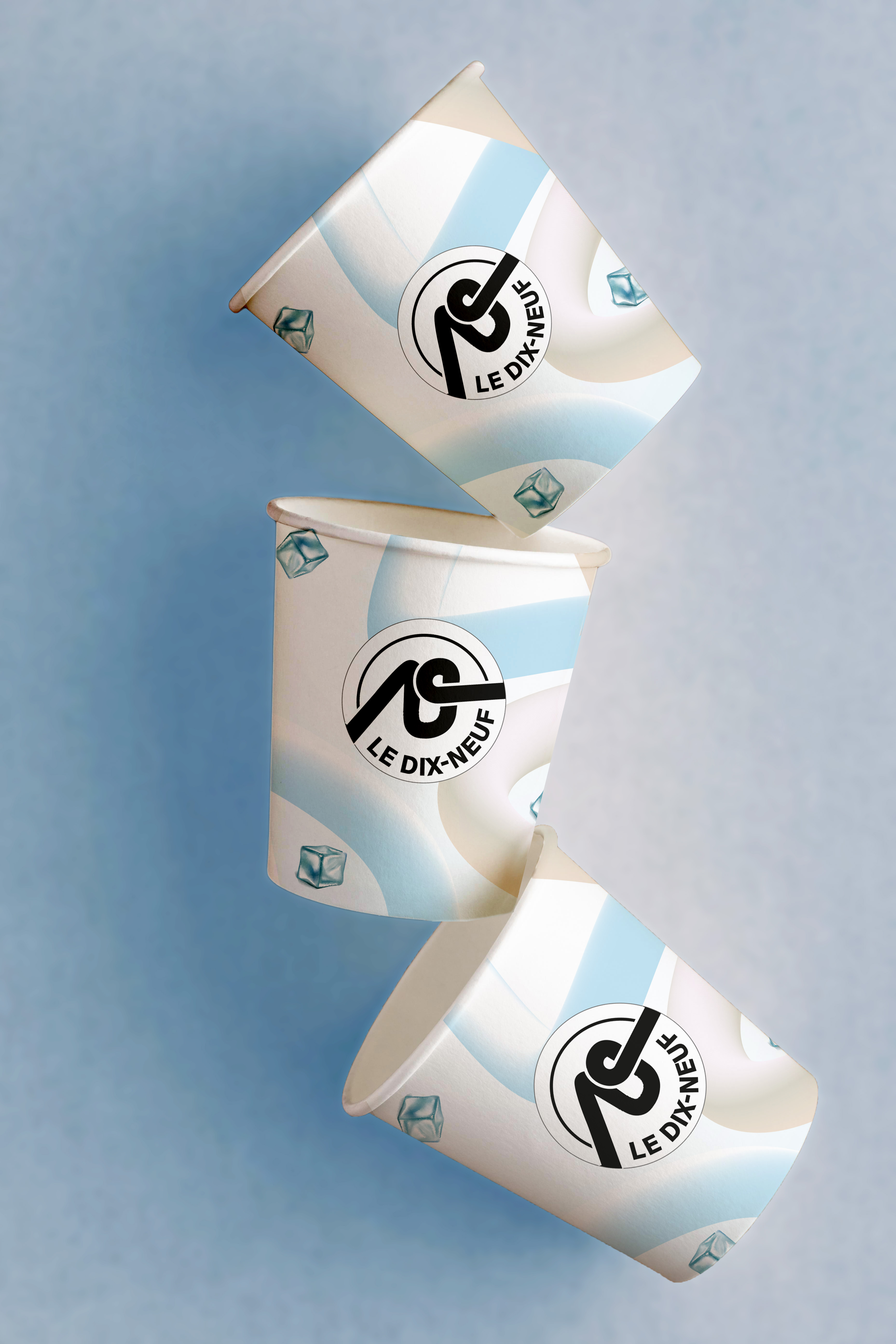
The color scheme features a striking black-and-white base for the primary logo, creating a sophisticated contrast against the colorful "flavor flows." This contrast not only highlights the intensity and vibrancy of the flavors but also brings a sense of elegance to the brand's visual identity. By combining bold typography with dynamic, colorful elements, LE DIX-NEUF’s branding invites guests to engage in a sensory journey, transforming a simple meal into an immersive, memorable experience. This visual identity effectively captures the restaurant’s bold, creative approach to burgers, making LE DIX-NEUF a destination that celebrates both flavor and style.
At the heart of this concept are “flavor flows,” vibrant streams that symbolize the unique and dynamic fusion of tastes present in each burger. These flowing lines create a visual metaphor for the blend of ingredients, capturing the essence of LE DIX-NEUF’s culinary offerings. The logo itself is centered around the number 19, which is crafted with an organic, flowing design that echoes the concept of flavor blending. Below this, the words “LE DIX-NEUF” are set in a bold, linear typeface, anchoring the logo with a modern and confident style.
The color scheme features a striking black-and-white base for the primary logo, creating a sophisticated contrast against the colorful "flavor flows." This contrast not only highlights the intensity and vibrancy of the flavors but also brings a sense of elegance to the brand's visual identity. By combining bold typography with dynamic, colorful elements, LE DIX-NEUF’s branding invites guests to engage in a sensory journey, transforming a simple meal into an immersive, memorable experience. This visual identity effectively captures the restaurant’s bold, creative approach to burgers, making LE DIX-NEUF a destination that celebrates both flavor and style.
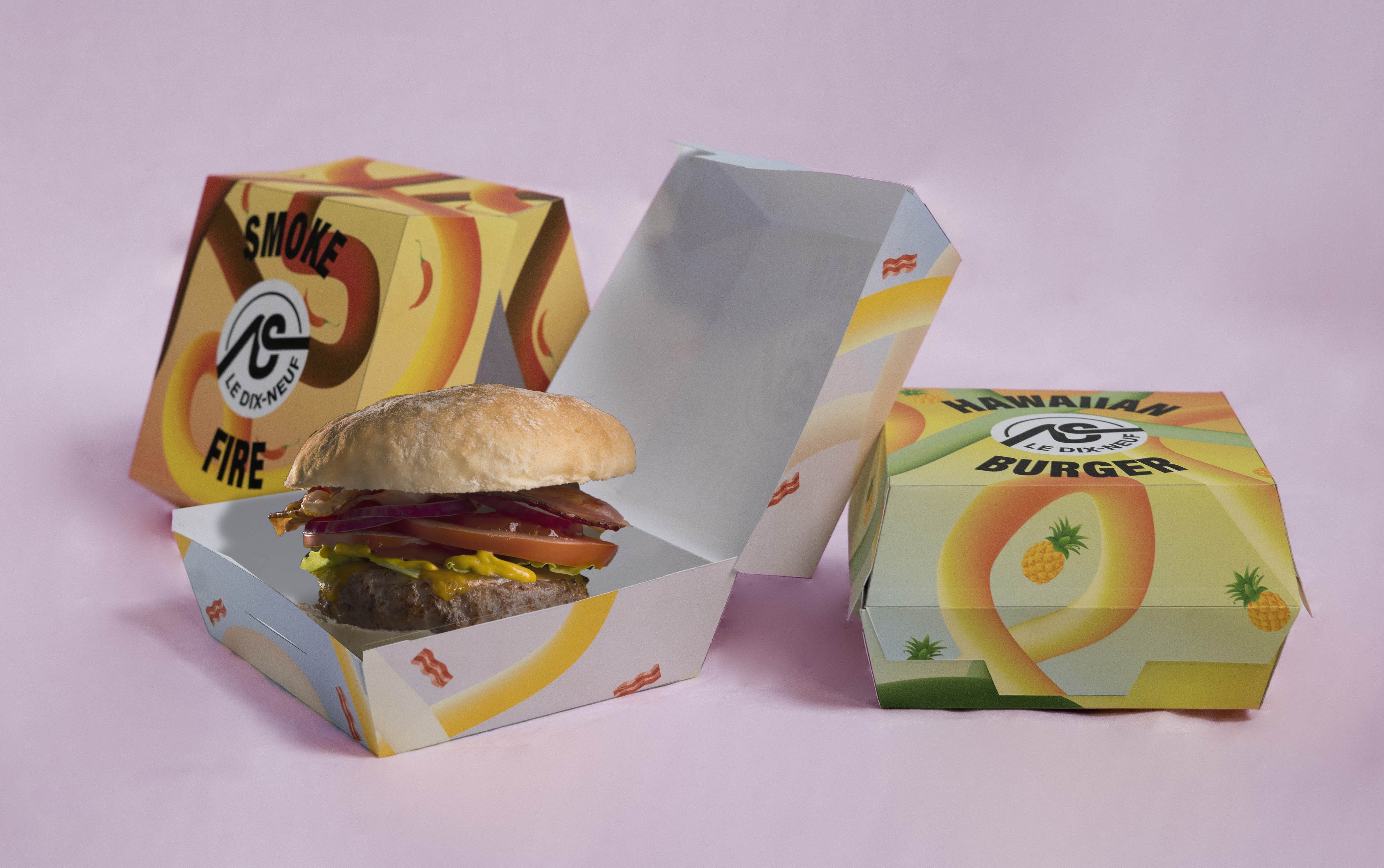
The packaging designs are inspired by the flavor flows, each accompanied by an illustrated ingredient featured in the recipe of each burger. The background is a gradient that reflects the colors of the ingredients or the atmosphere the recipe aims to evoke.
Here are three examples of burger concepts:
SUGAR RUSH A savory and sweet burger that combines crispy bacon with honey.
SMOKE AND FIRE A spicy burger featuring chili as the star ingredient, crafted to make you sweat.
HAWAIIAN BURGER A burger that sparks debate with its signature ingredient, pineapple.
The logo is placed at the center of the packaging, surrounded by the names of each burger. The typography of the burger names is designed to match the style of the logo, creating a cohesive look that stands out within the brand's visual universe. This approach ensures that each element is both visually appealing and aligned with LE DIX-NEUF's identity, enhancing the immersive dining experience.